Art Russe Wine Chess Battle
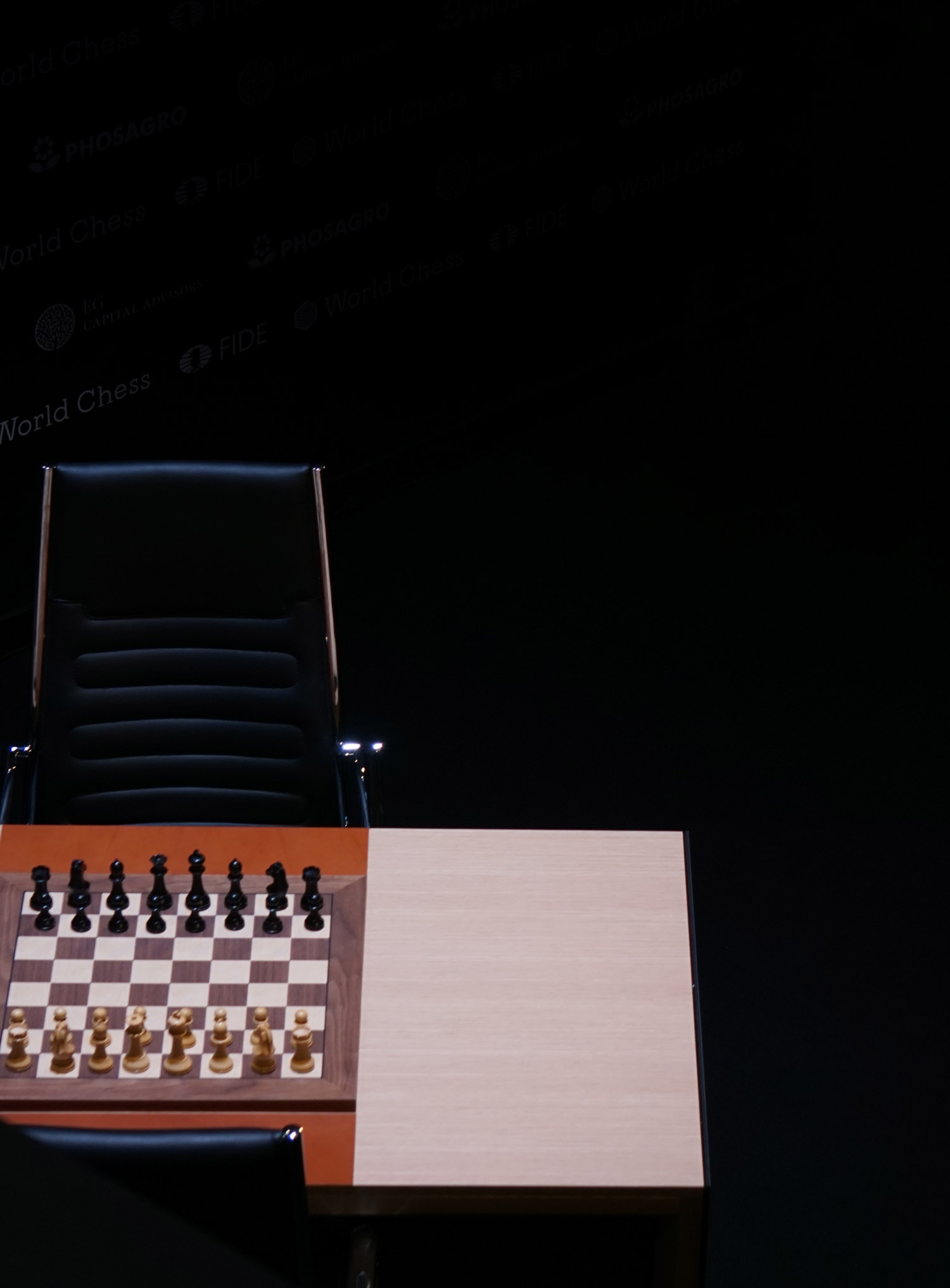
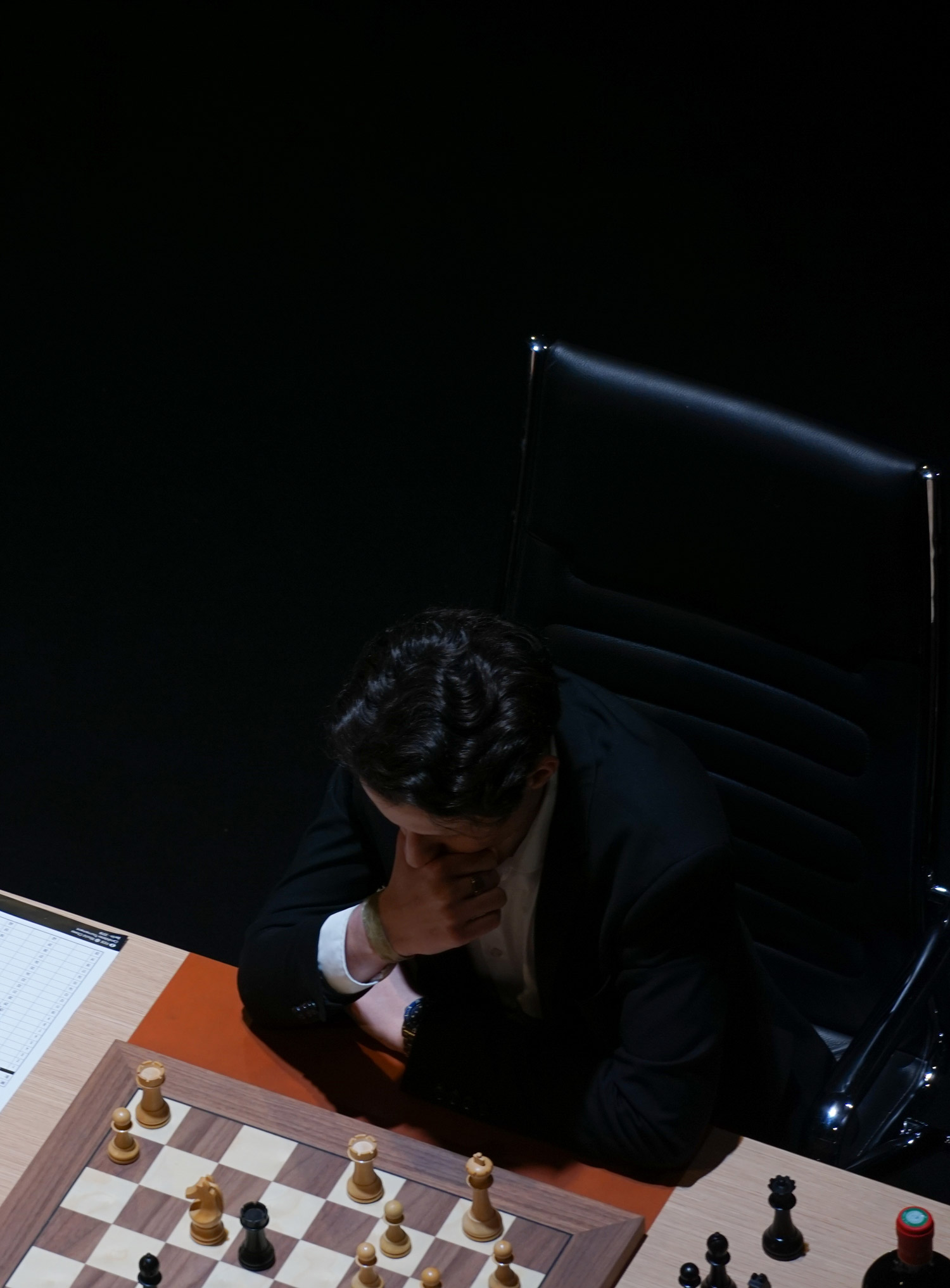
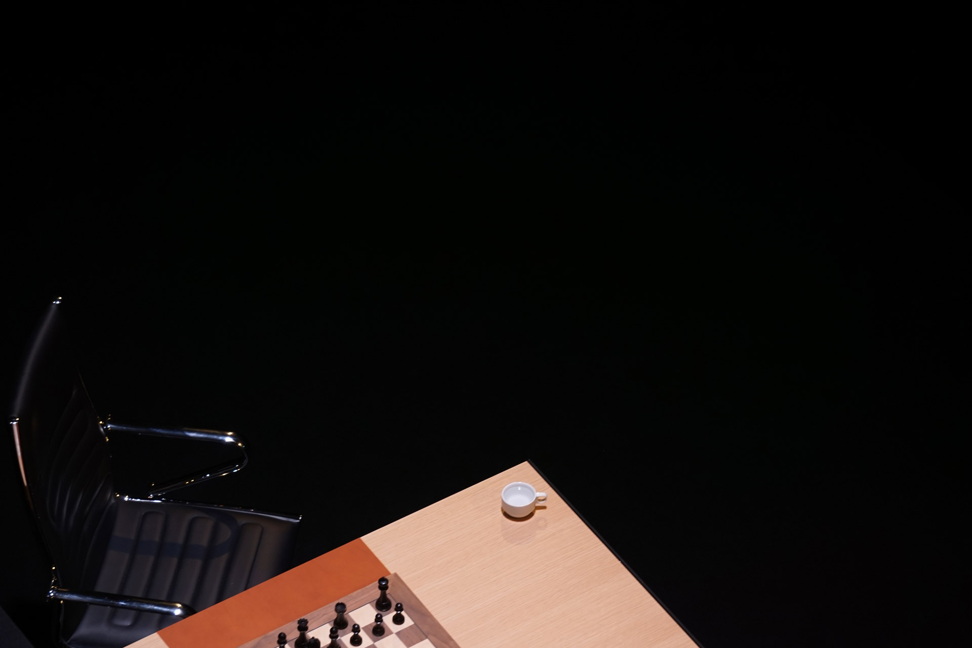
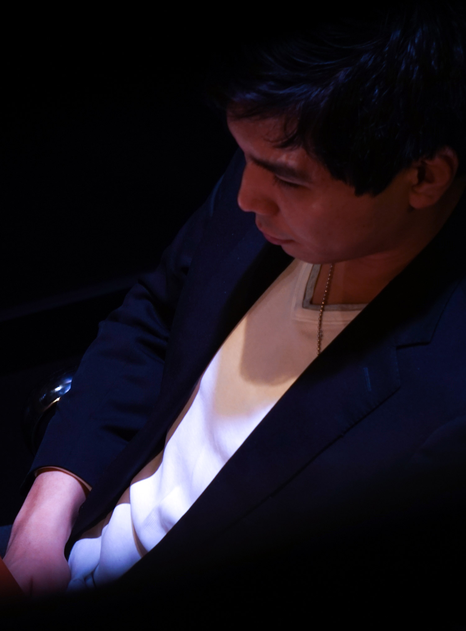
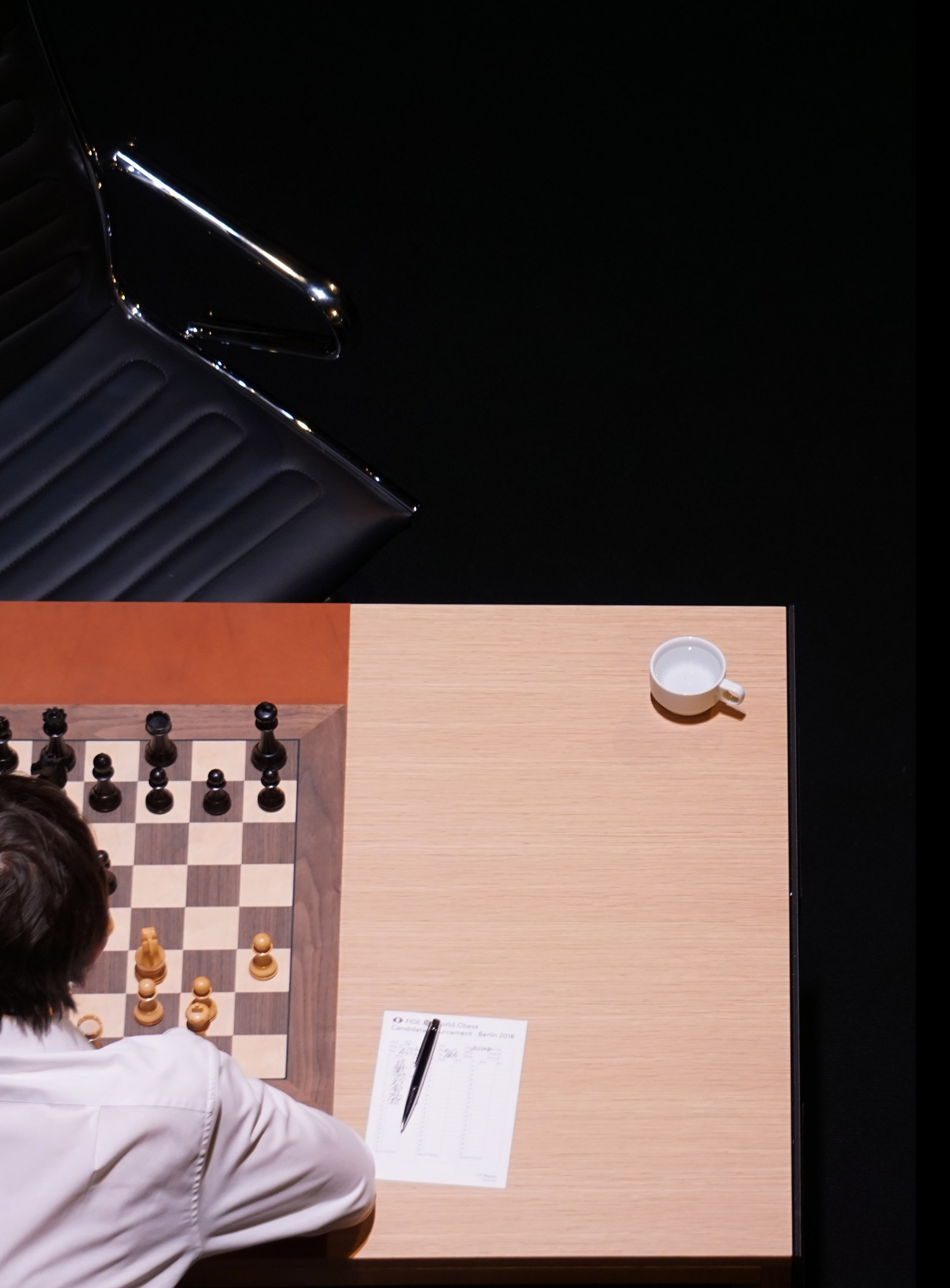
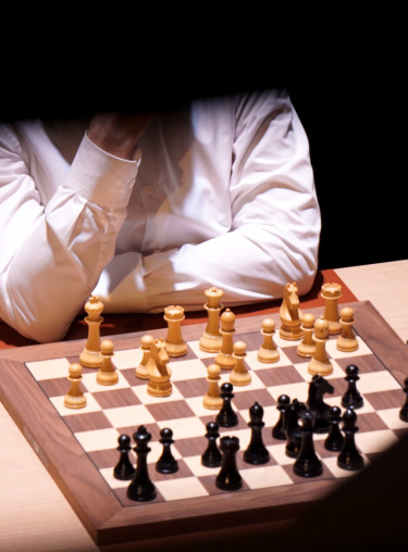
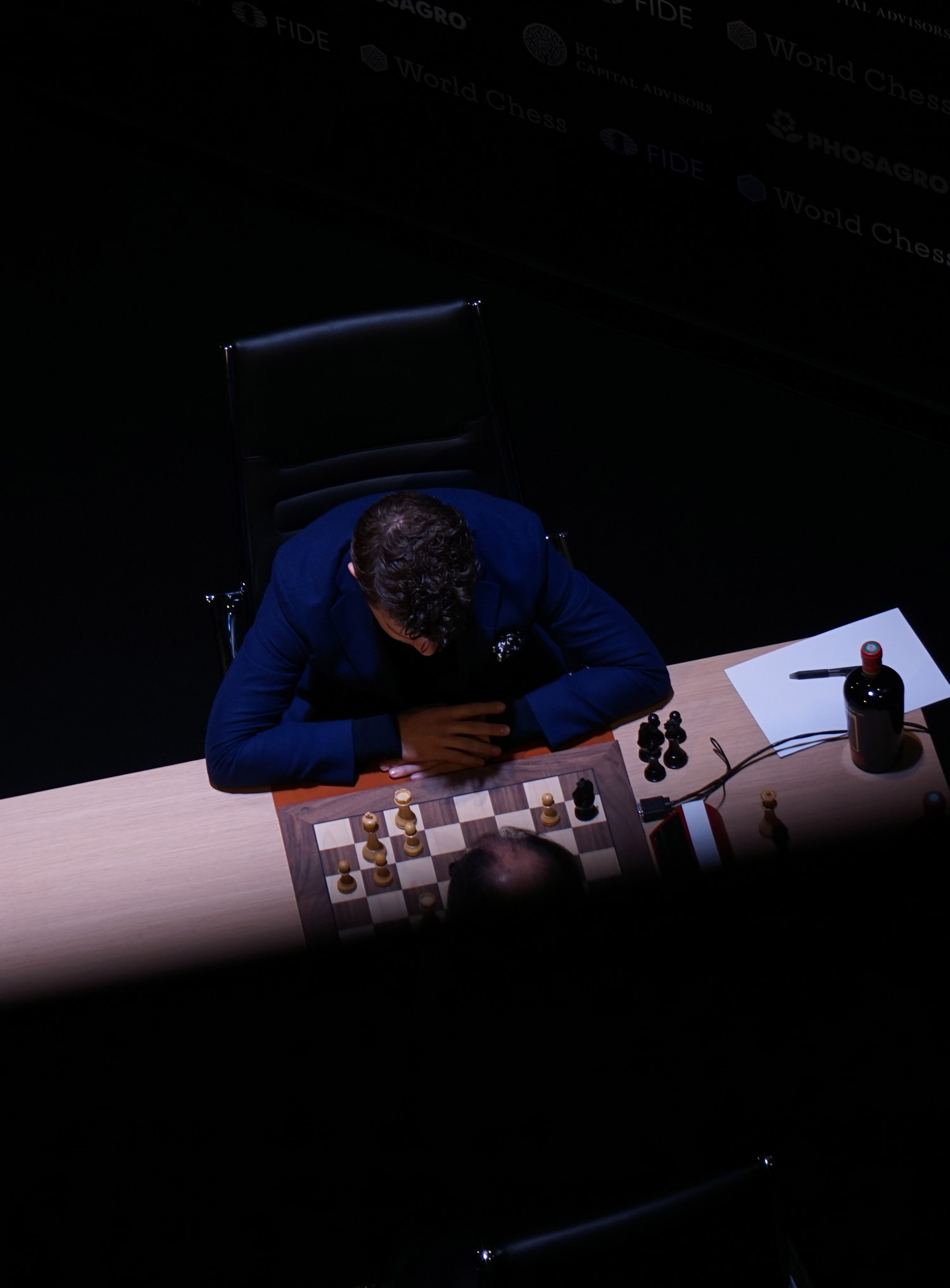
The World Chess Candidates Tournament is the second most important competition in chess. Eight of the world’s best chess players fight for the chance to compete against world champion Magnus Carlsen. Around the tournament Art Russe organized the Wine Chess Battle, which gave four amateur players from the wine and hospitality industry the opportunity to compete against each other. The winner was pleased to receive a Special Chess Case Edition containing six wines from the Art Russe collection, embracing art and wine. The editorial accentuates impressions from the Candidates Tournament and the Wine Chess Battle.
Make the first move
the great silence
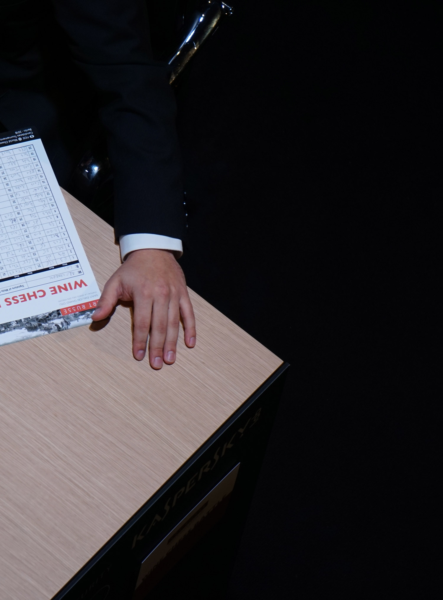
striking in angles
colors diminish
flux of peace
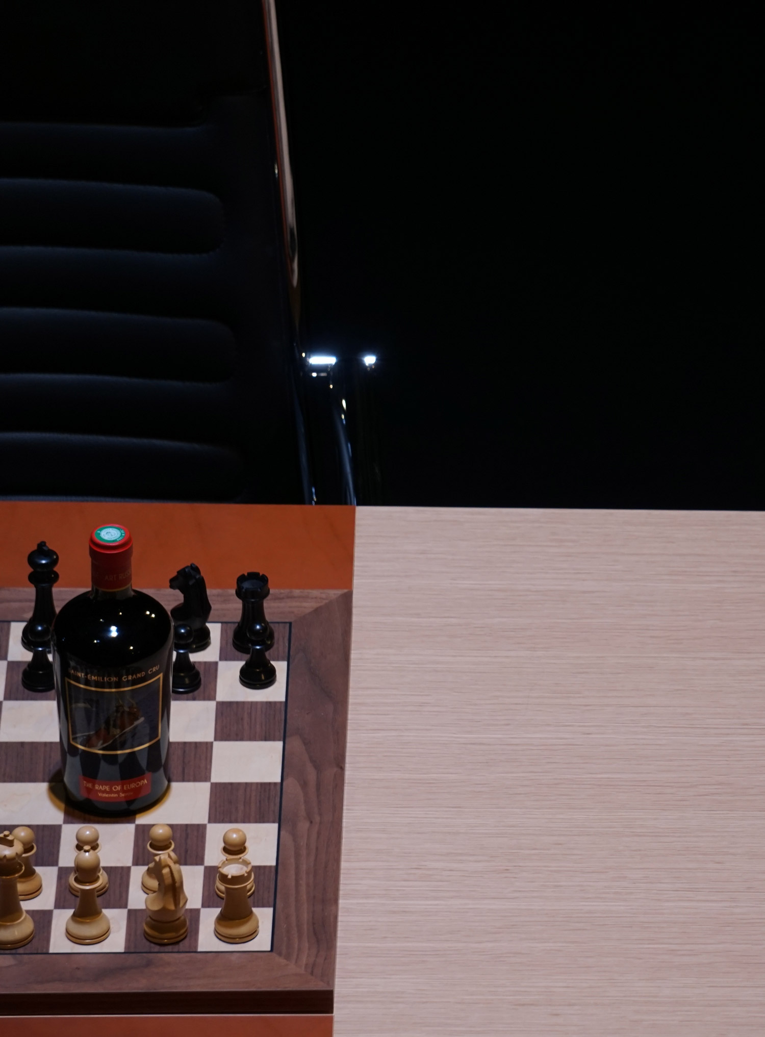
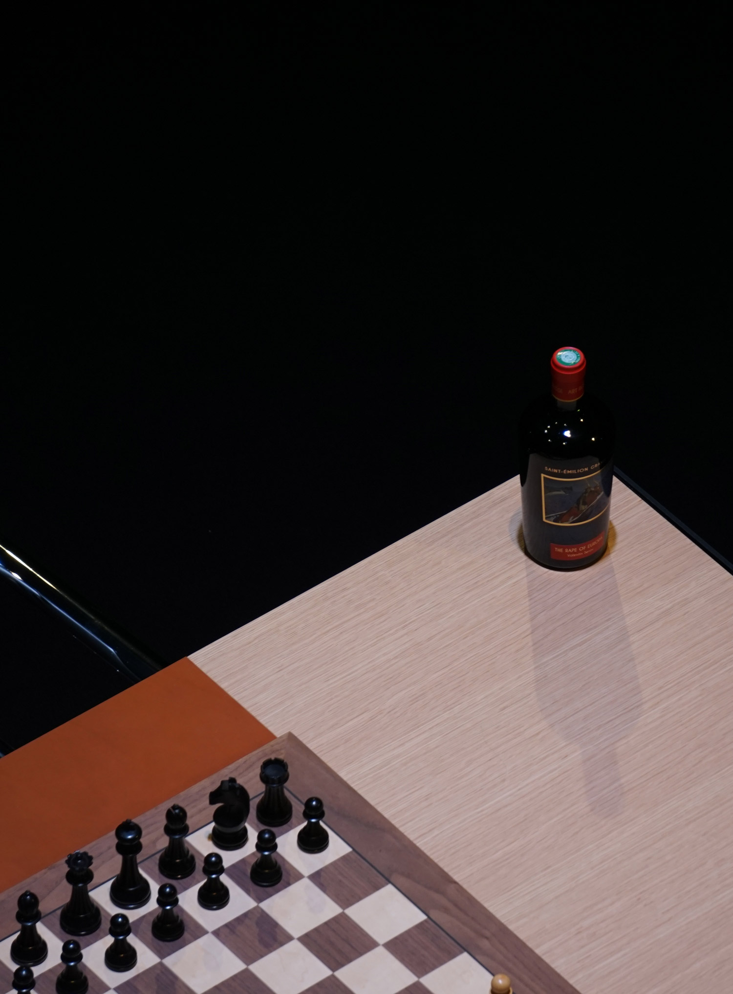

Art Russian combines art and wine. But wine and art are sufficiently self-sufficient. Mostly in positive correlation. If you are looking for aesthetics in design and taste, Art Russe Wine Chess Edition is worth to pay attention. A trialogue between origin, handcraft and spirit.
Art and wine
Andrey Filatov, a philanthropist with a passion for French art and culture, always dreamt of fusing his two passions in a single project. The realization of his dream to make Russian art visible with the taste of St. Émilions great potential is the basic idea behind the Art Russe project.
Art Russe is the result of a joint project of the Art Russe Foundation, a foundation that houses around 400 works of art and one of the largest collections of Russian paintings and sculptures from 1917 to 1991 and Château La Grâce Dieu Prieurs in Saint-Émilion that owns nine hectares of vineyards and produces around 35,000 bottles a year in the Grand Cru appellation.
Everything is different
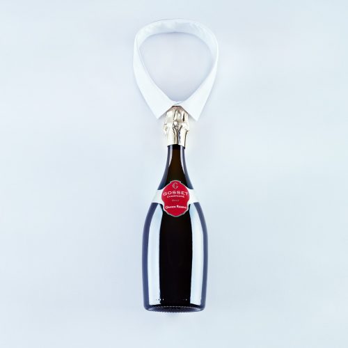
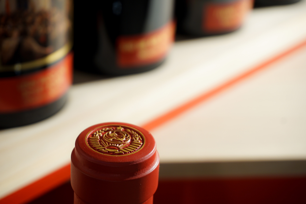
Anyone who follows his passion with so much love and dedication will pay attention to every little detail within the product implementation. So far done with the bottle design. A special form of the bottle is a nod to the past. Formerly, this green glass jar, reminiscent of traditional amphorae, was often used to better preserve the wine. As a result, the bottle is shorter and wider in diameter than the bottles used today, providing stability and thus storage, less exposure to light and better temperature control of the wine.
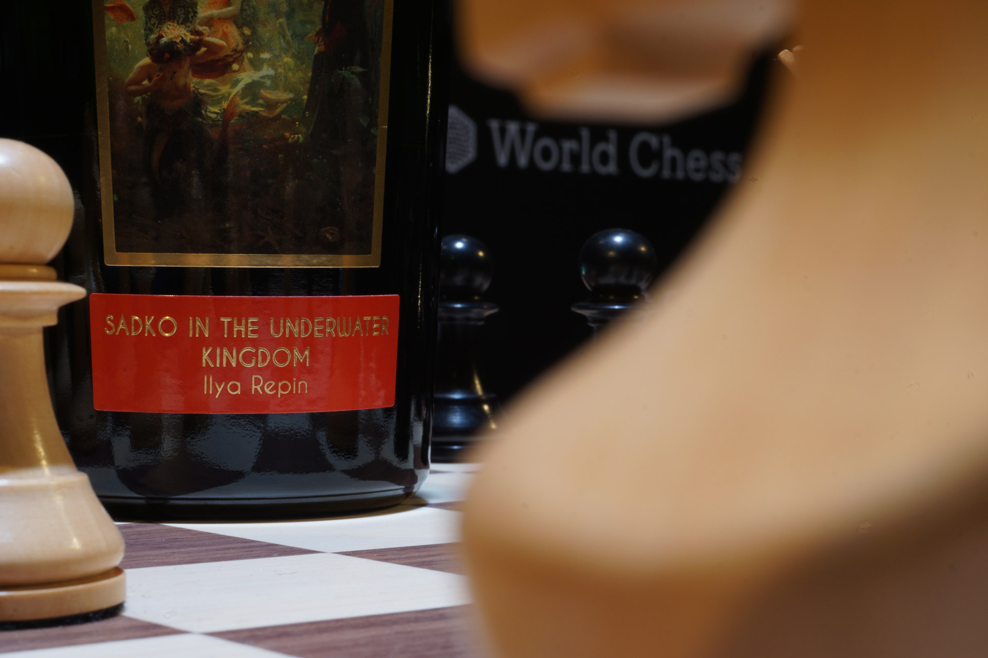
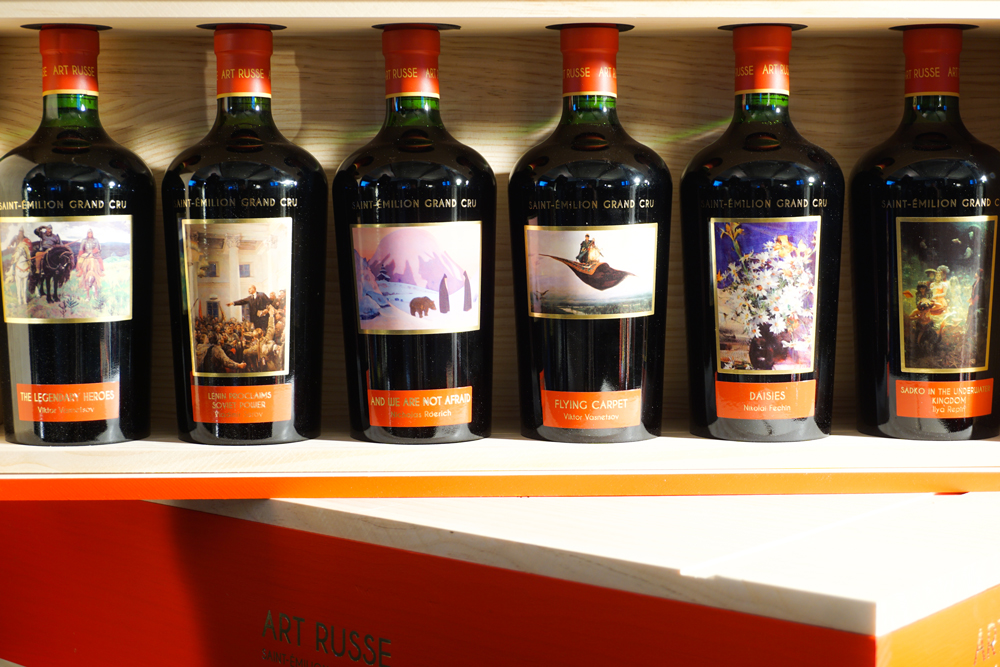
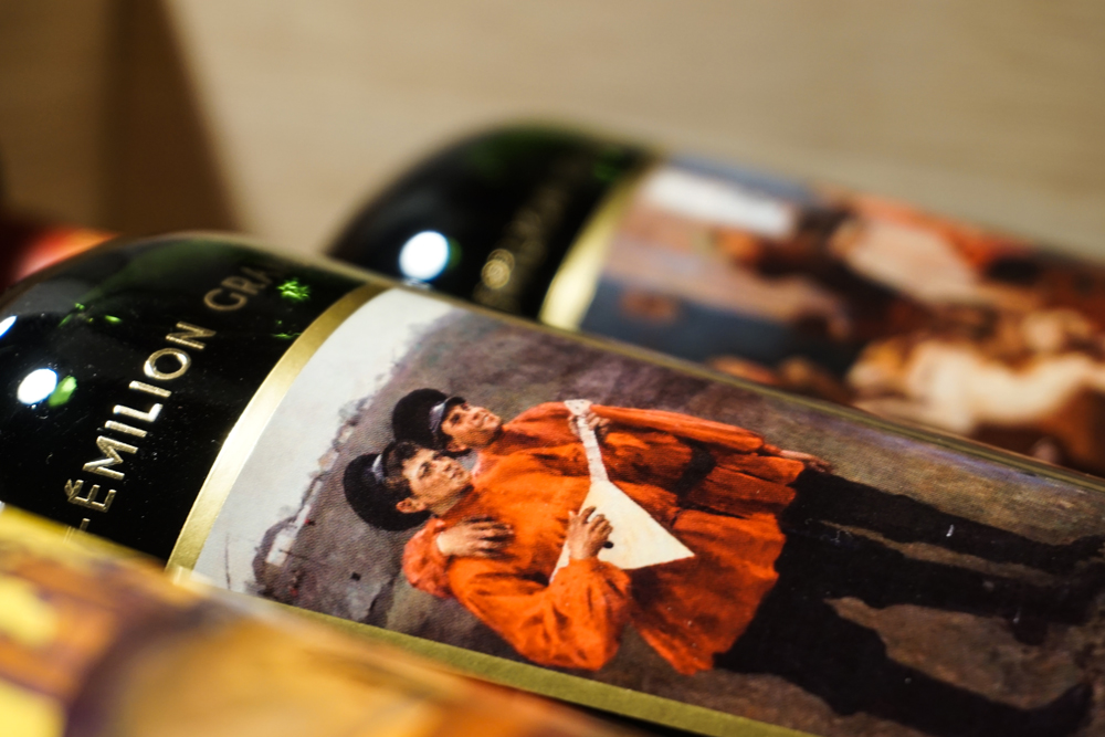
The label – The Russian soul
If a wine label is the reflection of the wine itself, the red color reflects the Art Russe´s Russian soul embraced by the taste of French terroir. Every year 12 different labels of Russian art feature the vintage. In 2014, the first vintage, the labels accentuated Russian artworks of the 19th century. A year later, the collection spotlights artworks of the 20th century featuring mainly unknown artists.
Architecture – Gravity
Together with Jean Nouvel, an architectural space with the winemaking process at its very heart was created. The buildings are positioned so as to recreate a farmyard surrounded by vineyards. Each building is a true piece of art in itself and has its own functional purpose.
The Girondine, the Vat and the Cellar, the Belvedere and the Fortin each represent a link in the process of creating and marketing the wine. Inside the cellar, stainless steel and mirrored fermentation vats serve as the canvas for a conceptual anamorphic image of Yuri Gagarin in zero gravity with wine and Gods. On the outside, the cylinder is a real cyclorama carrying an allegorical fresco on the work at the vineyard. An underground gallery connects the estate’s buildings.
The Wines
2014:
It was a difficult year for St. Emilion. The summer was pretty cool. But the kick-off vintage is quite interesting. The fruit is reduced. Space to accentuate the soil. Iron, blood, forest combined with intelligente use of barrels. A surge of violet note. A wine that is very interesting for wine connoisseurs. Happy to drink now or wait 4-6 years.
2015:
A vast contrast to the year 2014. Better weather conditions could drives the fruit in the wine. This is a darling wine. A wine which delivers on a promise of high quality Bordeaux wine. Excellent balance between fruit and texture. The wood is wonderfully integrated. Notes of chocolate, plum. Elegant, long finish. Already unexpectedly accessible, but will dive again. Store until 2020-2025. To wait every single year is worth it.
+ info
© Words and photos Weinkrake